Chameleon skin - fixedhead layout - wide content area (1-10-1)
From Bootstrap - Demo Wiki
The fixedhead layout has a full-width horizontal navbar at the top and a near full-width toolbar at the bottom of the page. It differs from the other full-width layouts because the navbar does not remain visible when the page is scrolled.
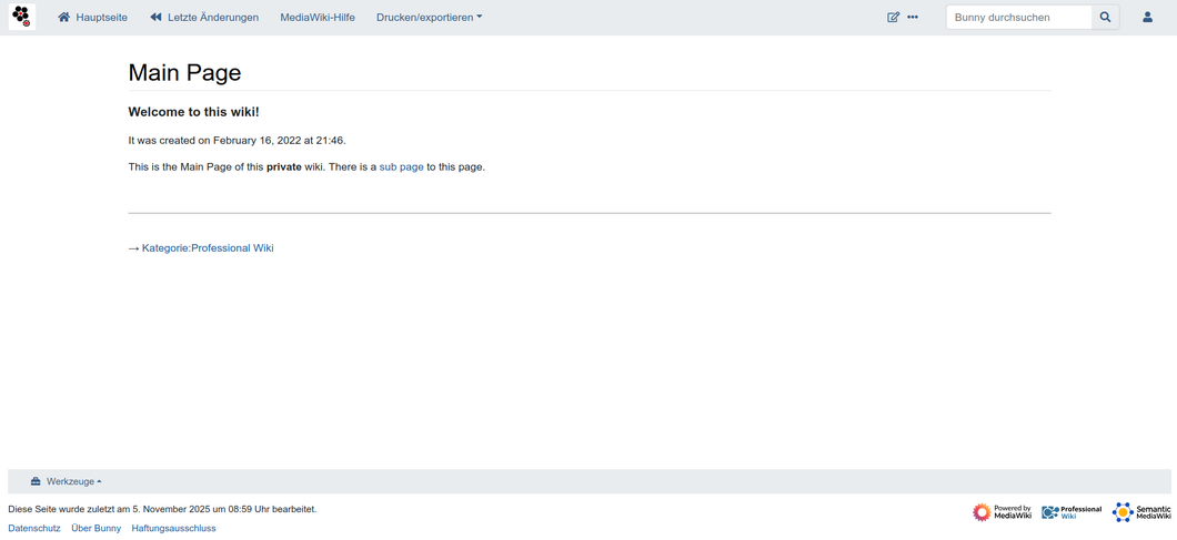
This is what the Chameleon skin looks like when using the fixedhead layout with a wider acontent area (columns: 1-10-1).
Result
Code
<structure xmlns="https://professionalwiki.github.io/chameleon/schema/3.5/layout.rng">

	<component type="NavbarHorizontal">
		<modification type="Sticky"/>
		<component type="Logo" position="head"/>
		<component type="NavMenu" flatten="navigation"/>
		<component type="Menu" message="secondary-menu"/>
		<component type="PageTools" class="flex-row" position="right" hideSelectedNameSpace="yes"/>
		<component type="SearchBar" class="order-first order-cmln-0" position="right" buttons="go"/>
		<component type="PersonalTools" position="right"/>
	</component>

	<grid class="flex-fill">
		<row>
			<cell>
				<component type="SiteNotice"/>
			</cell>
		</row>

		<row>
			<cell class="col-10 offset-1">
				<component type="MainContent"/>
			</cell>
		</row>
	</grid>

	<grid class="mb-2 mt-4" mode="fluid">
		<row>
			<cell>
				<component type="NavbarHorizontal" collapsible="no" class="small mb-2" >
					<component type="Toolbox" flatten="no" class="dropup"/>
					<component type="LangLinks" flatten="no" class="dropup"/>
				</component>
			</cell>
		</row>

		<row>
			<cell>
				<component type="FooterInfo"/>
				<component type="FooterPlaces"/>
			</cell>
			<cell>
				<component type="FooterIcons" class="justify-content-end"/>
			</cell>
		</row>
	</grid>
</structure>
The difference to the standard fixedhead layout is that it added
class="flex-fill" to the <grid> tag, and class="col-10 offset-1" to the <cell> tag defining the content area.